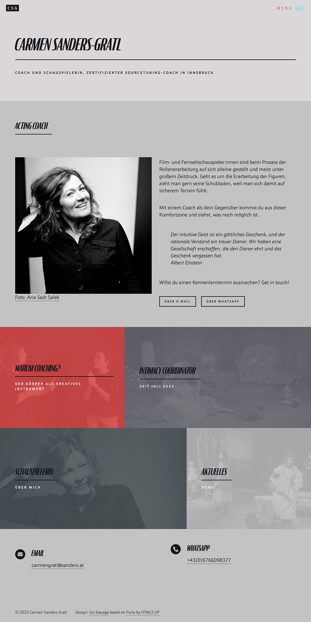
Typography, portrait photography and the website colour theme all work together.
Carmen Sanders Gratl is an Austrian actor and intimacy coordinator based in Innsbruck. Together we designed a website to showcase her work. Organising her multifaceted skills and experience into an accessible tool for students and casting directors was the biggest challenge which turned out to be solved with simplicity and elegance.
Typography, portrait photography and the website colour theme all work together.
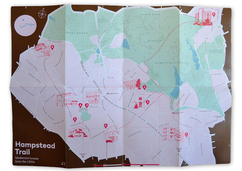
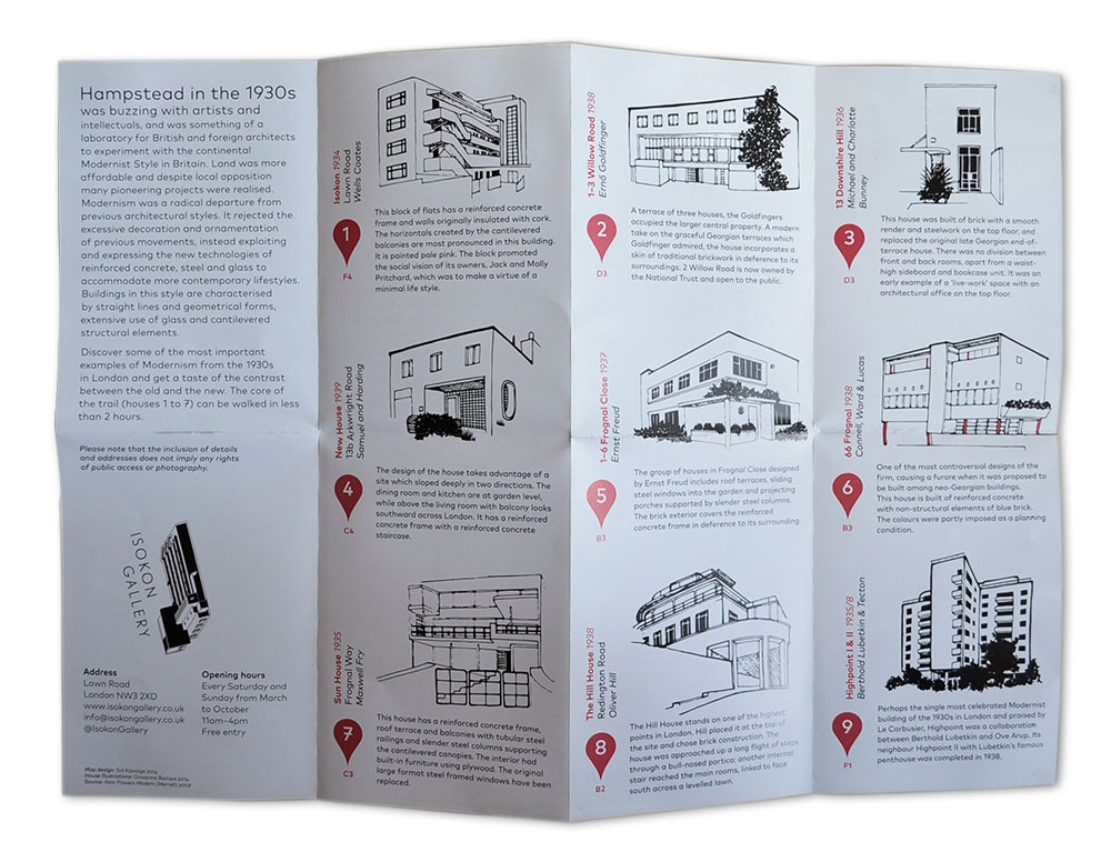
In 2014 I designed the Hampstead trail map, to guide visitors of the Isokon Gallery to a walking tour of modernist houses in Hampstead.
Illustrations by Giovanna Bampa.
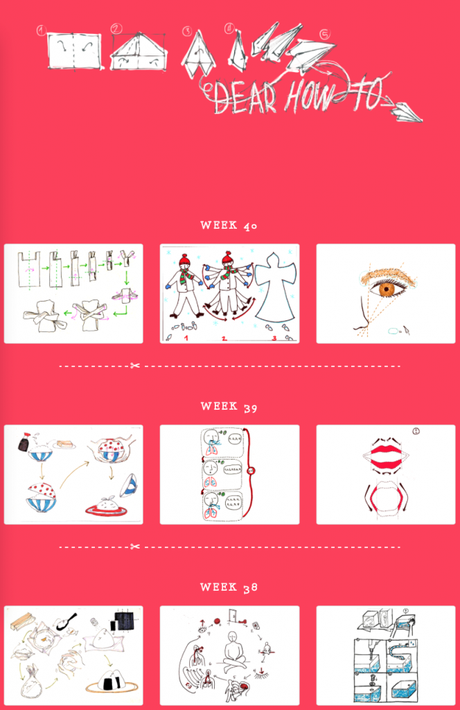
Dear how to is a year-long project, in which three information designers explore the possibilities of instruction design. Each week for a year, finishing in August 2017, we think up instructions, draw them on a blank postcard and send them in turn to one or the other. In order to push ourselves to be as clear as possible with our diagrams and drawings, we avoid text entirely. This means that the instructions that we draw go beyond language barriers. We choose the tasks to draw instructions for from our day-to-day lives, and they comprise a catalogue of sorts of our modern world. The results are presented weekly in a website called dearhow.to, where viewers are encouraged to read the postcards and try to make out their meanings, before revealing the title.
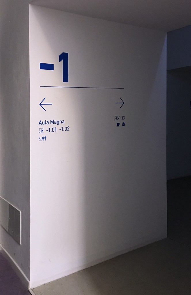
Wayfinding for unibz Bruneck.
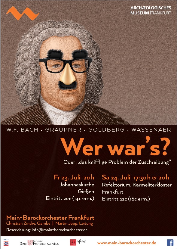
Concert poster for Main Barockorchester Frankfurt.
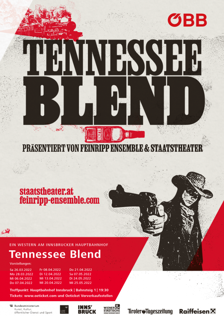
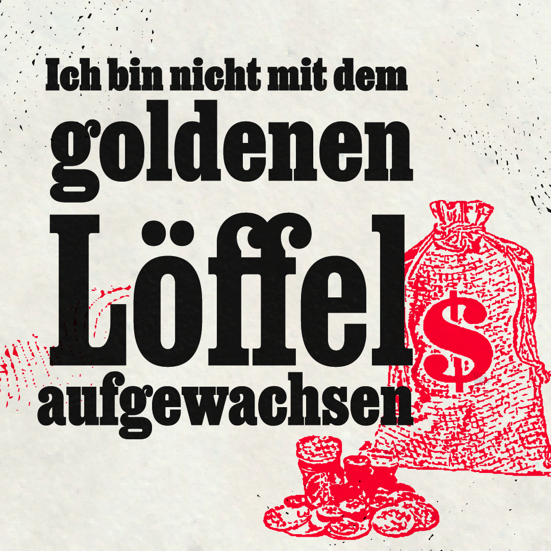
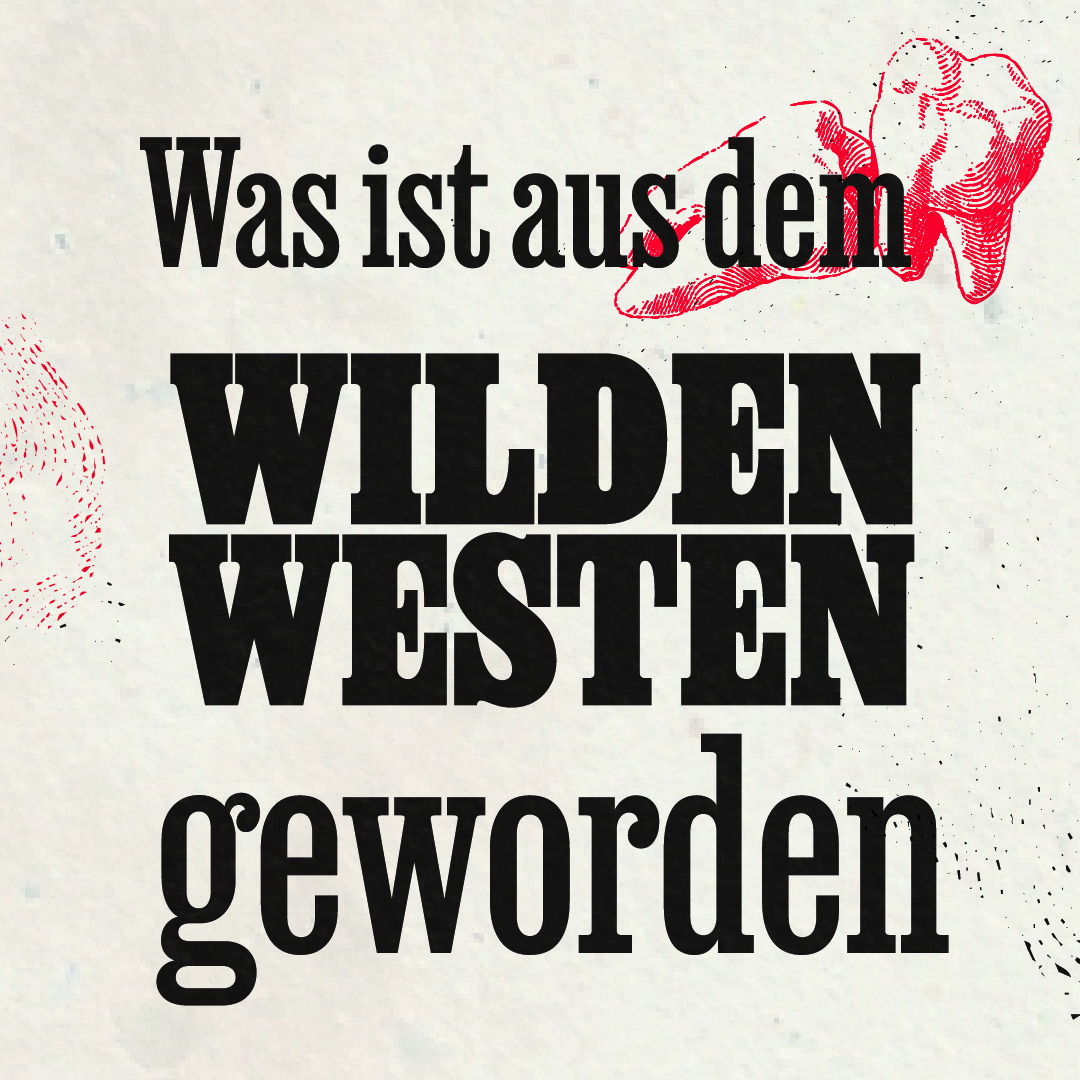
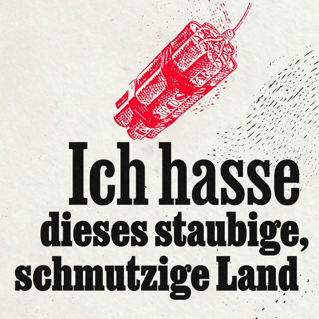
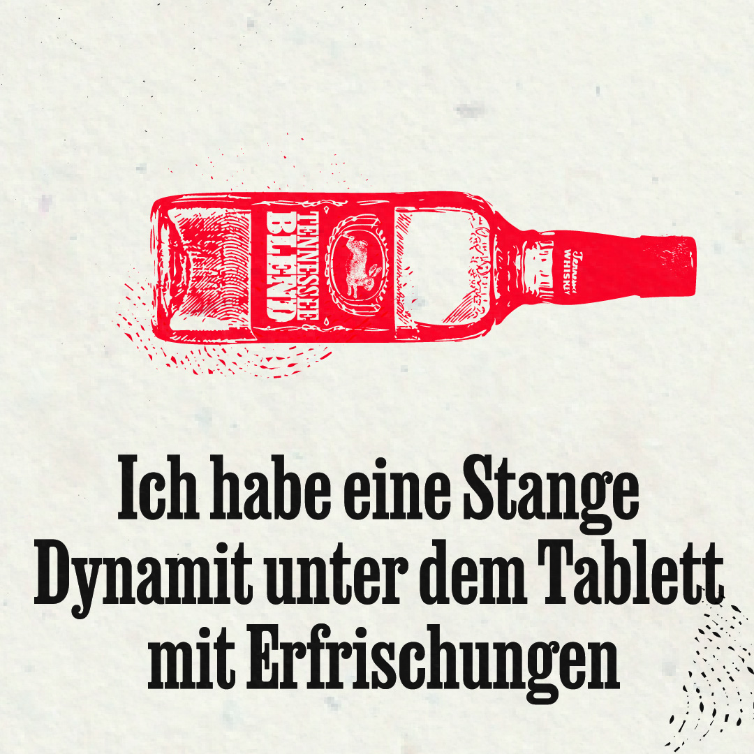
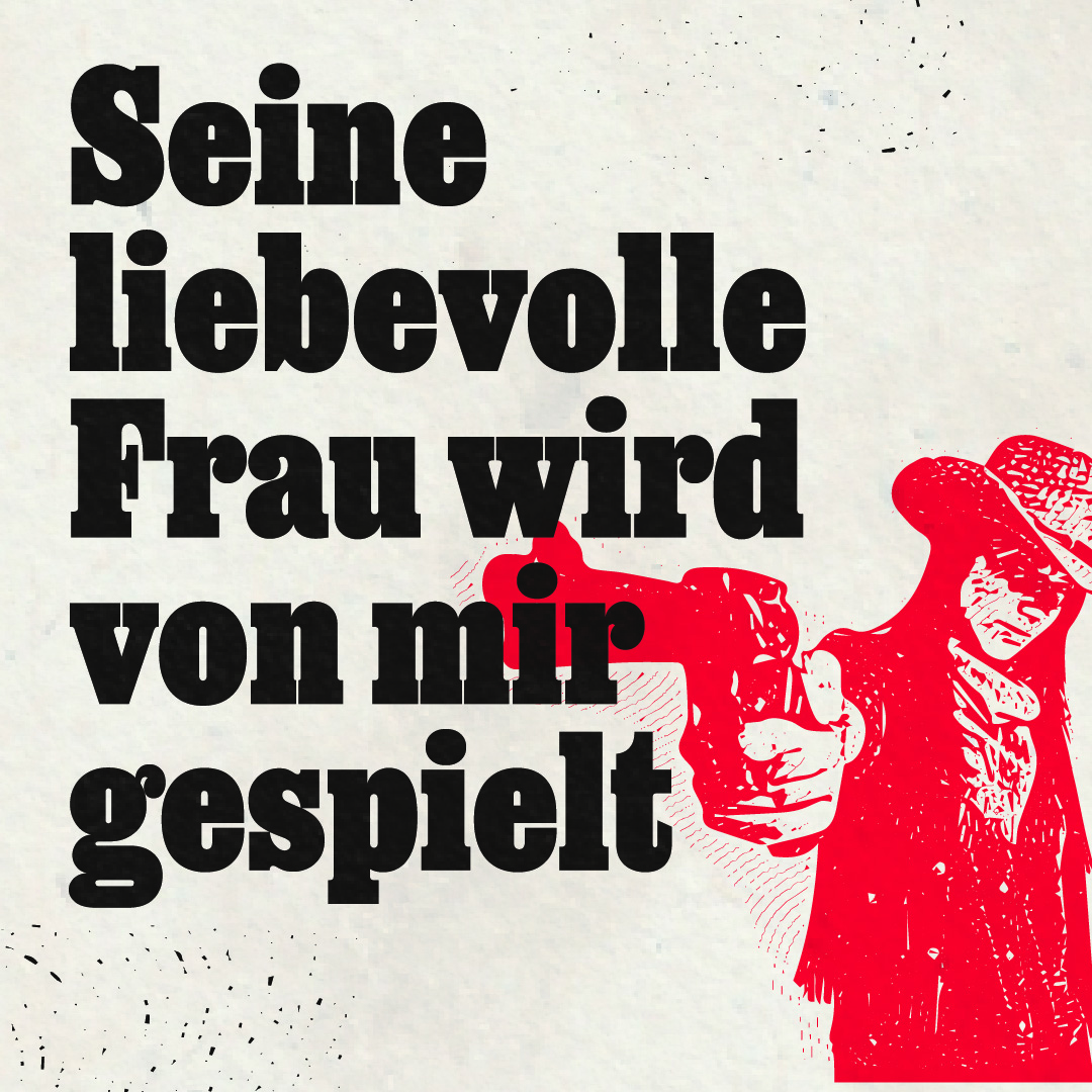
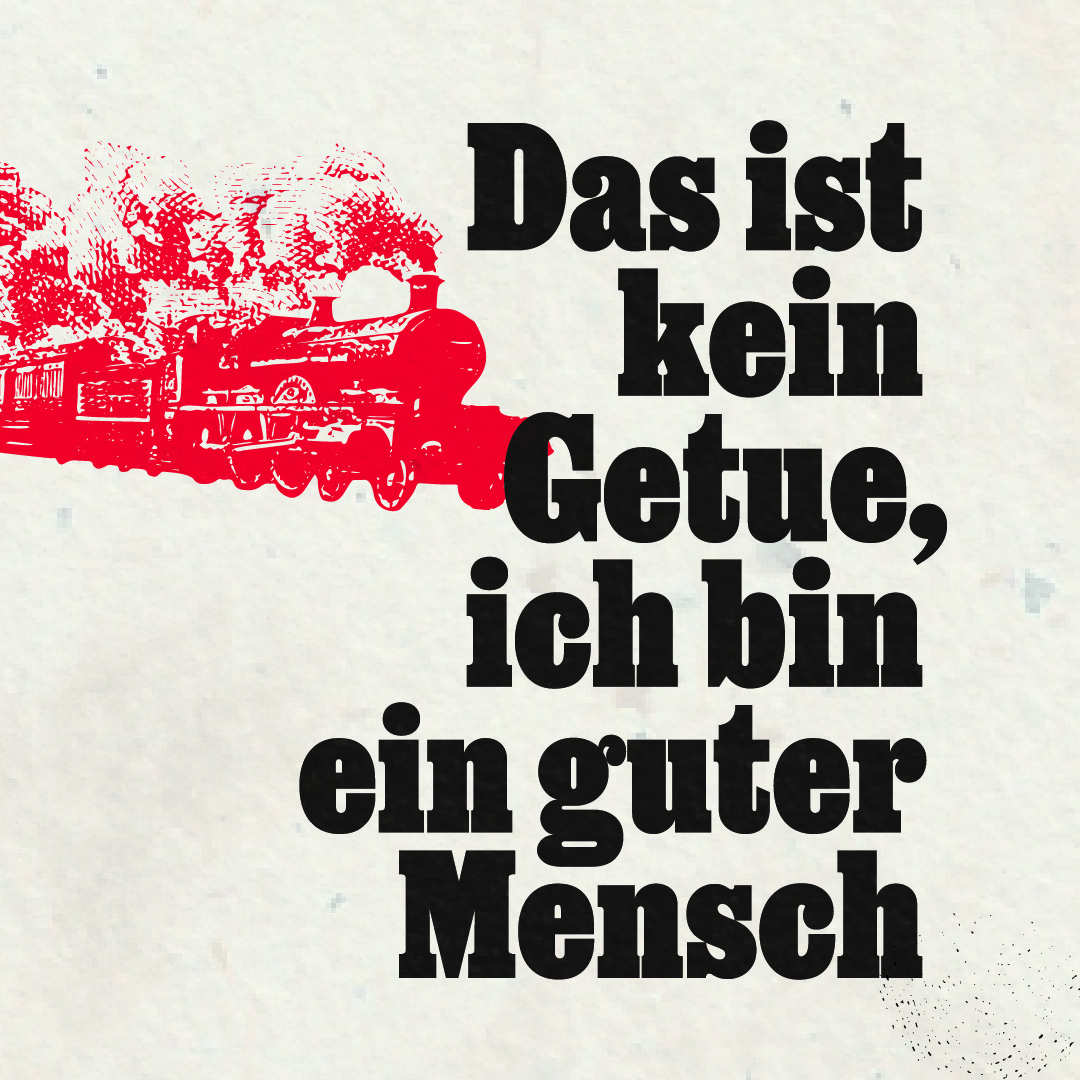
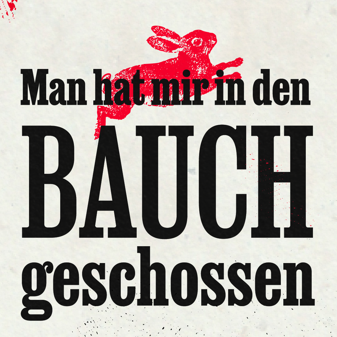
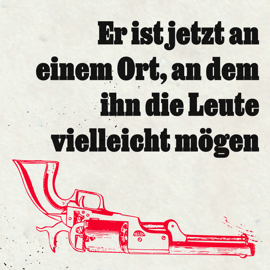
Poster and promotional postcards for Tennessee Blend, a Wild West play by Austrian theatre companies Staatstheater and Feinripp Ensemble. Sponsored by ÖBB, the Austrian railway company, the public is taken by dedicated trains to the roundhouse of Innsbruck’s main train station, where the play is staged. The posters are displayed on commuter trains throughout the Tirol region for the duration of the performance run, March through May 2022. Designed by Sol Kawage, the title is set in Job Clarendon Variable, as are the postcards with quotes from the play. The postcard information is set in Acumin Variable.
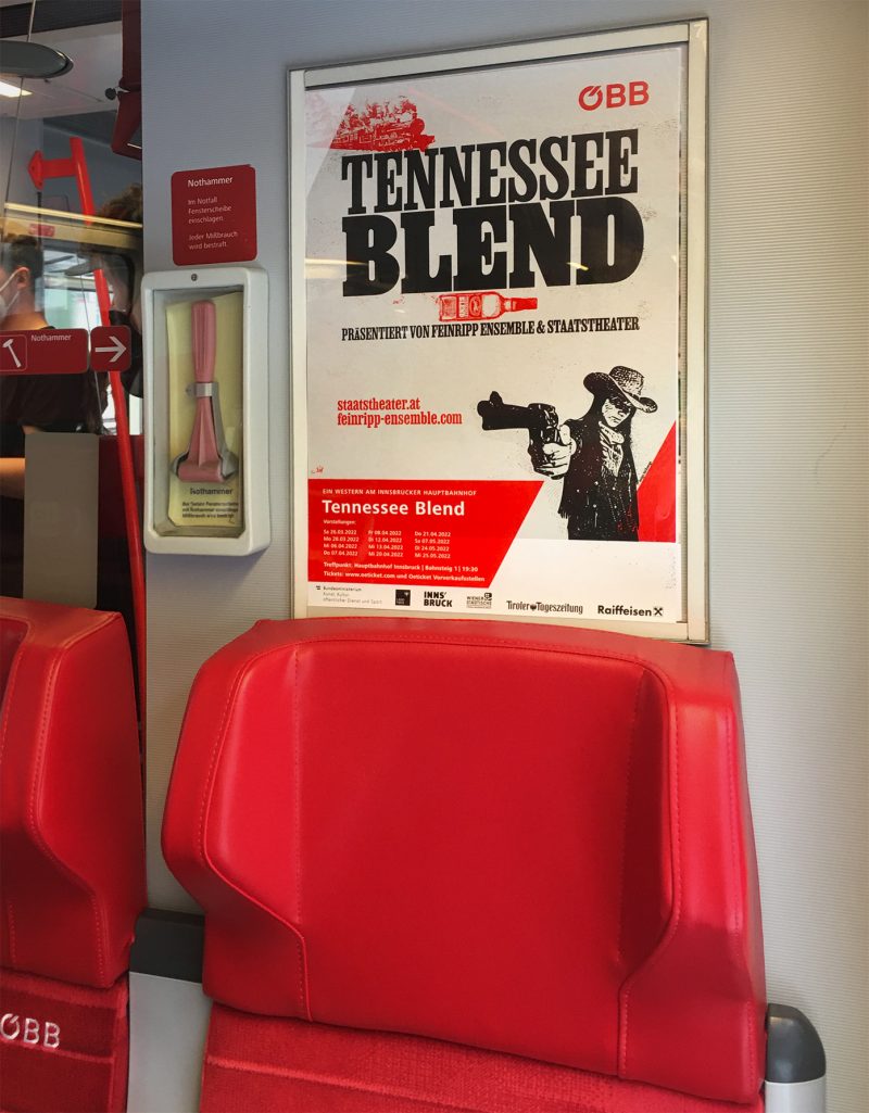
Poster hanging in commuter trains throughout Tirol during the play’s performance run.

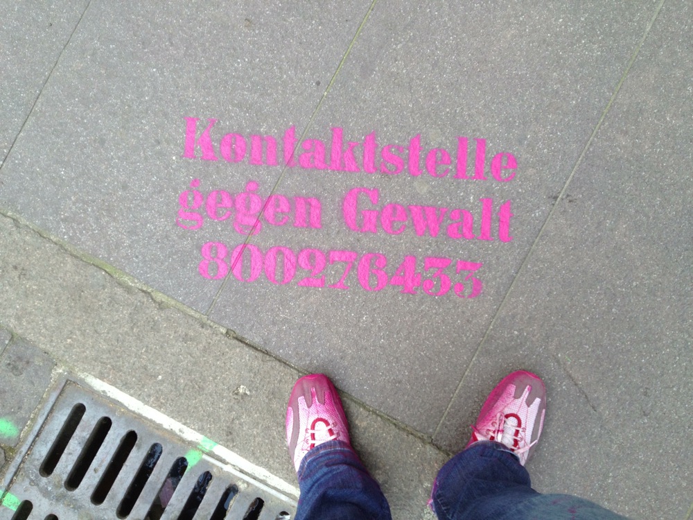
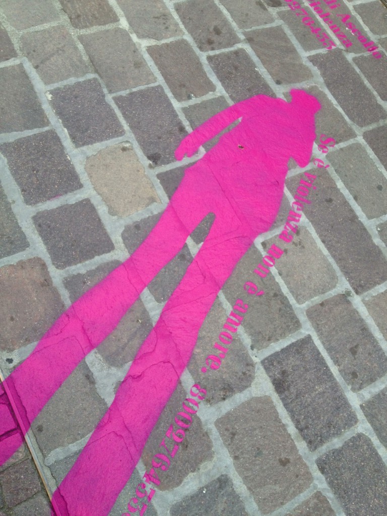
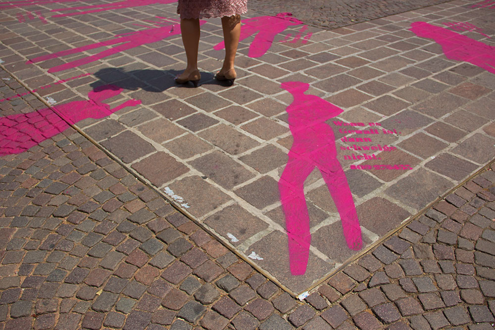
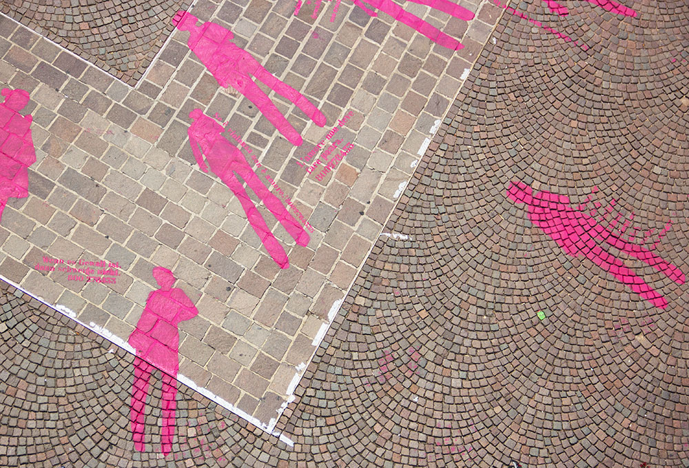
People tend to look away from topics like violence against women, and organisations that help women often struggle to reach a wide audience. The installation used the street as a canvas to send various messages, in a way impossible to miss. Le Corbusier was chosen because it has presence and elegance, which are hard to find together in stencil typefaces. The messages included an emergency contact number, and messages for men: “solidarity towards women is what makes you a man”. The installation was realized for a Visual Communication project at the Free University of Bolzano, under the supervision of Prof. Giorgio Camuffo.

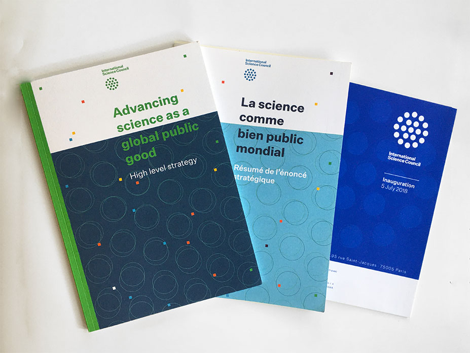
Publications and conference programme for the inauguration of the newly created International Science Council.
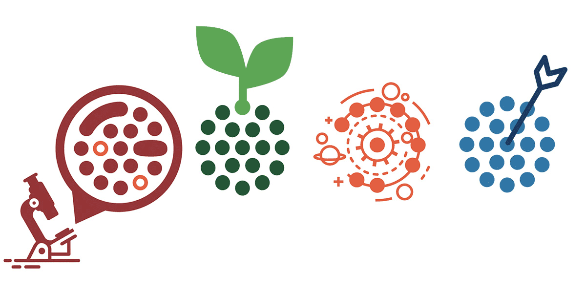
Series of illustrations that used their logo as a starting point as access structures for their manifesto text.
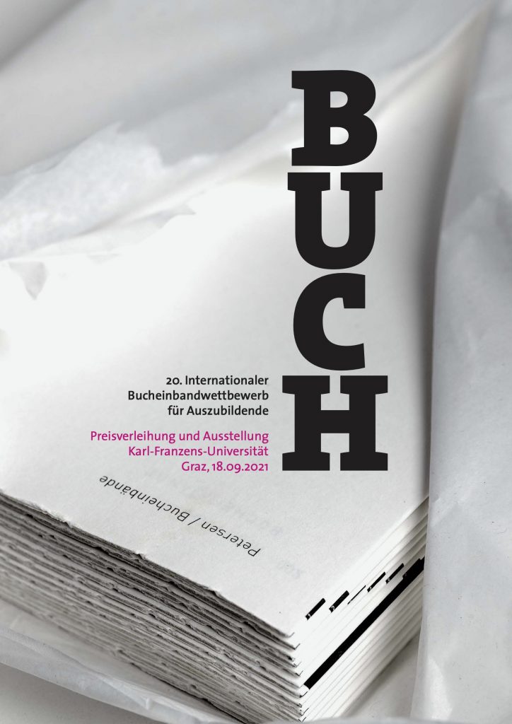
Poster and invitation design for the 20th International Bookbinding Apprentice Competition, Graz 2021.
Poster design.
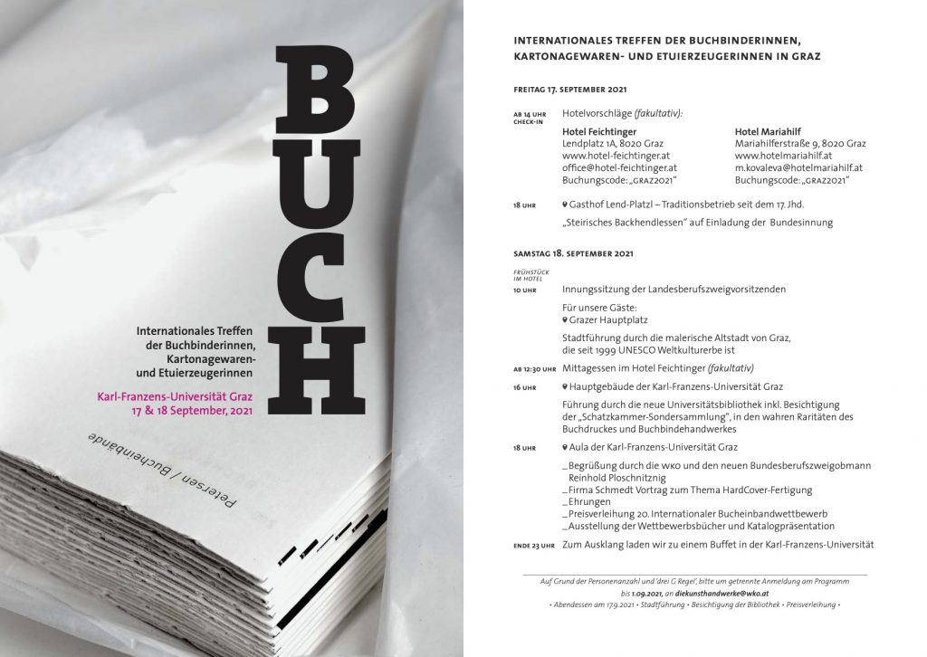
Invitation design.
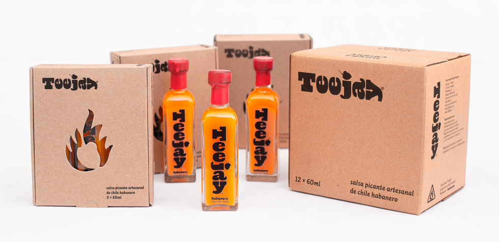
Brand identity and packaging design for TeeJay hot sauces. Available on Amazon.com.mx.

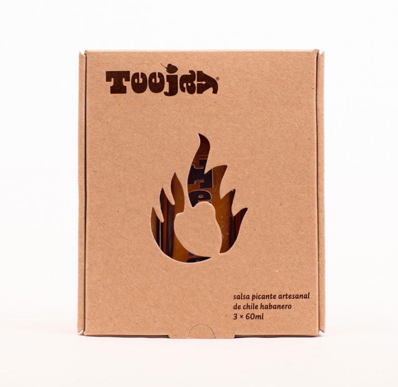
Die cut box of three bottles.
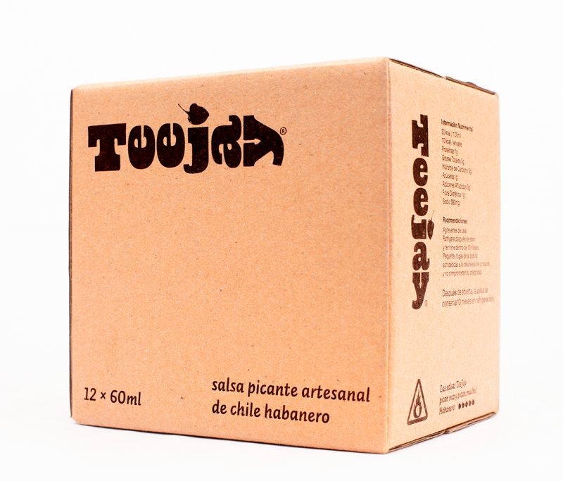
Box of 12 bottles for wholesale retail.
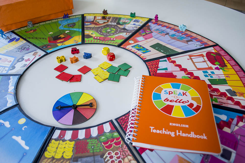
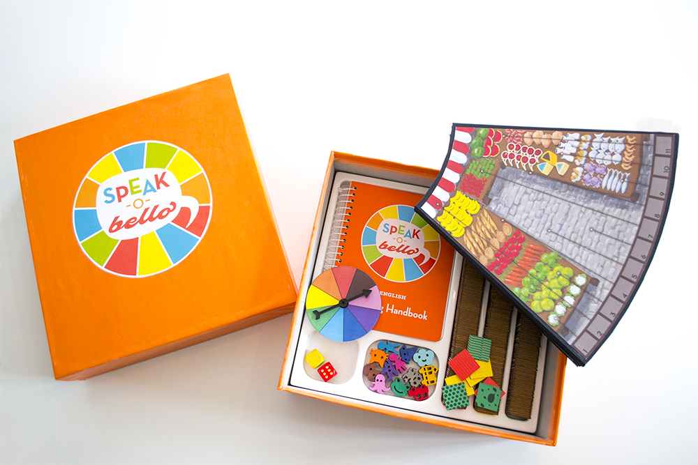
In 2016 I developed, designed and illustrated a board game to teach languages.
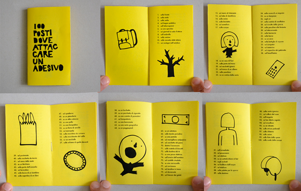
100 places where to stick a sticker
2012 Illustrated mini-book, part of a guerilla action guide.